
Advertising comes in a variety of forms and the banner is an effective way to effectively communicate a short message. Whether you are promoting a sale or event or even want to simply share information within a local area, displaying a banner gets the job done. The question is how to create a highly visible one. What needs to be considered?

Fonts or Typeface Matters
Using more than two different types of fonts can make your banner look busy and disorganised which can be a huge turn-off for readers. In addition, you need to consider the distance from which the banner will be read. Do you want people driving slowly by to be able to read it or will it be in an enclosed area with a close audience?
For the main message, sans serif fonts are often considered ideal, particularly for long distance viewing. Secondary messages on the banner can be effectively seen using regular serif fonts. Fussy fonts such as Old English or Script are not very appropriate for banners unless it fits the overall theme of what is being advertised and the viewer has plenty of time to read it, such as if the banner were displayed indoors for a captive audience. Finally, try to avoid creating a banner with all-caps letters. The readers’ eyes take longer to process all-caps typeface versus a mixture of lower and uppercase letters.
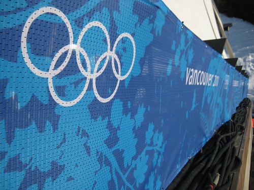
Graphics and Colour Combinations
Any type of artwork, graphics or logos can enhance the look of a banner. However, too much of a good thing can overpower the large sign and diminish the overall message. Take note of other banners you have seen in the past and try to remember what garnered your attention in the first place. Likely, it was a simple, eye-catching graphic which drew your attention to the rest of the banner’s message.
Colour combinations can also make or break the effectiveness of a banner. If you are trying to attract quick attention with a simple message, consider a colour such as fluorescent yellow or orange with a simple font colour such as black or red. A high contrast of colour combinations between the font and background make for easier viewing, particularly from large distances.
Consider White Space and Banner Margins
While you may want to stretch your graphics and letters across the entire banner to maximise the space used, try to refrain from doing so. In addition, avoid small text and graphics which would provide an abundance of blank margin space. The standard practice has been to make allowances for the top and bottom margins of a banner to be about 10% of the total height while the left and right margins allow at least the same amount of space that one or two font characters would take up.
The final step in creating an eye-catching banner is to consider how long the viewer has to see the banner as well as the distance over which it will be seen. Banners viewed by drivers likely will need to be bigger than those seen by pedestrian traffic. Use your best judgment with all of these variables to ensure your banner will be effective for your advertising needs.
Chris Jenkinson recommends Sherwood Signs for all of your banner needs.